They just change the name of the company and it s location IG PROJECTKNOWLEDGE
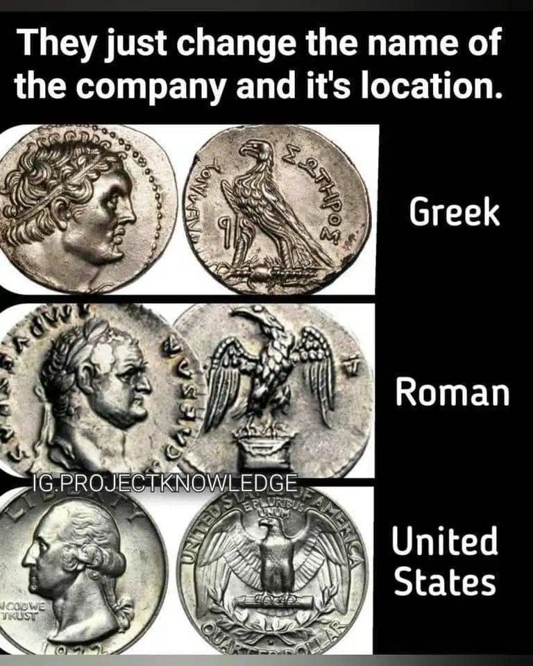
The image depicts a humorous comparison between coins from different historical periods: ancient Greek, ancient Roman, and contemporary United States. At the top of the image, there is a caption that reads, "They just change the name of the company and its location." The joke implied here is the suggestion that the designs on these coins, separated by thousands of years and great geographical distances, are products of a single "company" that merely rebranded and relocated over time.
In the first row, we see two ancient coins labeled "Greek." The coin on the left features a profile portrait that appears to be of a Greek figure, possibly a god or a ruler. The coin on the right displays an image of a bird, which looks like a particular stylized eagle, common in Greek symbology. These coins are artifacts from a time when Greece was a cradle of Western civilization, famous for its art, philosophy, and political systems.
Below the Greek coins, the second row presents two coins labeled "Roman." The left coin again shows a profile portrait similar to the Greek style but is distinctly Roman, identifiable by the laurel wreath, a common symbol of victory and honor in ancient Rome. The coin on the right bears a detailed image of an eagle with outspread wings, a powerful Roman emblem representing strength and authority.
The third row shows a single coin labeled "United States." This coin appears to be a modern quarter, displaying a profile portrait that resembles the classical style and an eagle with outspread wings similar to Roman iconography. This incorporation of ancient symbols into U.S. currency signifies continuity and a connection to the ideals and aesthetics of ancient Western civilizations.
The humor of the image lies in the playful suggestion that there is an enduring, monolithic "company" that has been designing currency from ancient times to the present. This whimsical anthropomorphization of historical trends in coin design slyly hints at the idea of a timeless corporate entity that's been responsible for coin designs over millennia. It plays on the familiar modern concept of company rebranding and relocation, comically applied to a historical and cultural artifact.
Furthermore, the fact that the U.S. coin, which represents the most recent iteration of these design elements, is part of everyday life, while the Greek and Roman coins are mostly encountered in museums or as collectors' items, adds to the humor. It's amusing to think that the same "designer" who crafted objects of ancient prestige is also responsible for the change jangling in our pockets today. The image draws an amusing parallel that spans history, poking fun at the way certain motifs seem everlasting, whether they are part of deliberate cultural homage or simply coincidental resemblances. They just change the name of the company and it s location IG PROJECTKNOWLEDGE
